Markup
The following are examples of supported markup. On their own, these will not provide a datepicker widget; you will need to instantiate the datepicker on the markup.
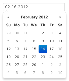
input
The simplest case: focusing the input (clicking or tabbing into it) will show the picker.
<input type="text" value="02-16-2012">
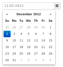
component
Adding the date class to an input-append or input-prepend bootstrap component will allow the add-on elements to trigger the picker.
<div class="input-append date">
    <input type="text" value="12-02-2012">
    <span class="add-on"><i class="icon-th"></i></span>
</div>
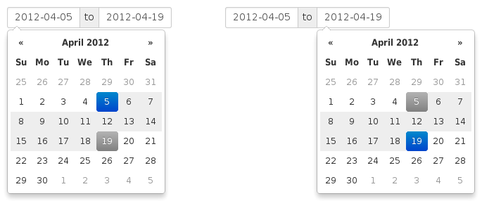
date-range
Using the input-daterange construct with multiple child inputs will instantiate one picker per input and link them together to allow selecting ranges.
<div class="input-daterange">
    <input type="text" class="input-small" value="2012-04-05" />
    <span class="add-on">to</span>
    <input type="text" class="input-small" value="2012-04-19" />
</div>
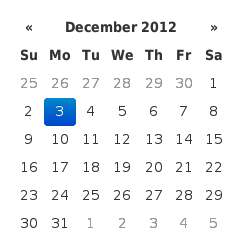
inline or embedded
Instantiating the datepicker on a simple div will give an embedded picker that is always visible.
<div data-date="12/03/2012"></div>
Example to save the embedded datepicker value to a hidden field
<div id="datepicker" data-date="12/03/2012"></div>
<input type="hidden" id="my_hidden_input" />

$('#datepicker').datepicker();
$("#datepicker").on("changeDate", function(event) {
    $("#my_hidden_input").val(
        $("#datepicker").datepicker('getFormattedDate')
     )
});